Grow Your Program
How Great Photos Help Boost Enrollment (or A Tale of Two Cupcake Classes)

Every business has a brand and whether you realize it or not, your program, large or small, has one too. You may not precisely know what it is, but you know that it’s certainly not dull, grainy, humdrum, blurry, ordinary, or boring!
It’s a near Shakespearian tragedy to see programs offering incredible classes using dull, grainy, humdrum, blurry, ordinary, boring, and other bad images in their advertising and catalogs (or worse yet – no images at all!). Such low-quality photos are not helping, and are definitely hurting your enrollments.
We Remember What We See
According to a report by MDG Advertising, people remember only 10% of information three days after hearing it, on average, but adding a picture can improve recall to 65%. Furthermore, 67% of consumers say that the quality of a product image is “very important” in selecting and purchasing the product.
It only takes about 50 milliseconds (that’s 0.05 seconds!) for users to form an opinion about your offering (website, product, or class) based on what they immediately see, which ultimately determines whether they’ll stay or leave. (CXL, 2019)
What this means is that you need photos to sell your classes, every time. Good photos. And because your classes may not be easily-photographed “things” those photos need to tell a story.
Telling Your Story
Classes aren’t widgets and it may feel harder to find “product photography” to entice prospective students to register for these experiences. The nature of experience is one of the most important reasons that you need great photography to increase enrollment. The right images will help motivate the right audience because they help tell a story to your visitor. Capture the essential story of a class with a snapshot and your students will want to be a part of it!
To help tell this story, let’s look at some examples. And because everybody loves cupcakes, we’re going to focus our attention on a class about cupcakes! (We used the image search that is part of CourseStorm’s registration suite when creating these examples.)
A Tale of Two Cupcake Classes
We’re sharing two different examples for two different classes – one class for all ages and levels of skill and the other one for those who are more advanced in cupcake making and decorating. As you look at the examples, think about why they feel different from each other based on what you see. What is your first impression of the class? Would you hit the “register” button?
Example 1: Basic Cupcakes for All Ages
|
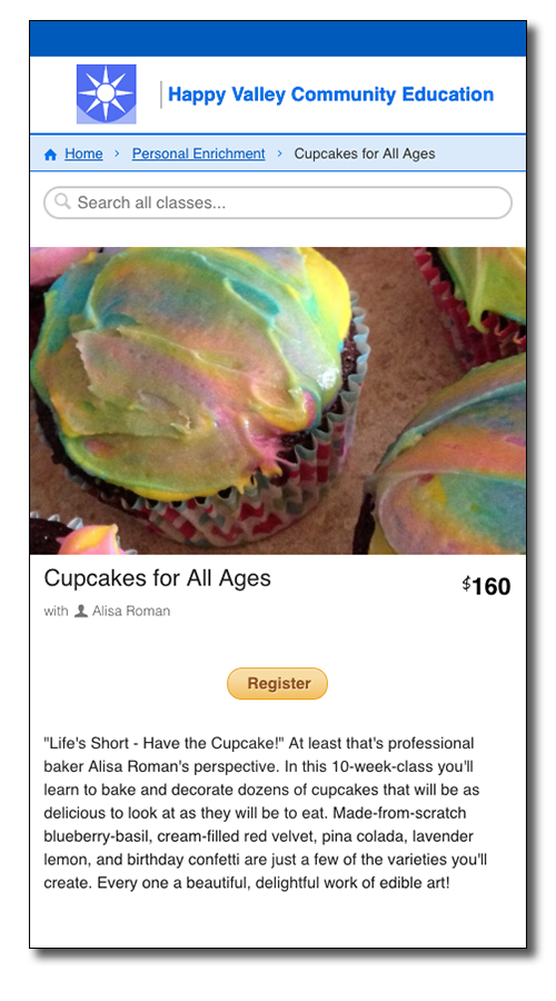
These swirled rainbow frosted cupcakes look tasty and simple but lack inspiration. |
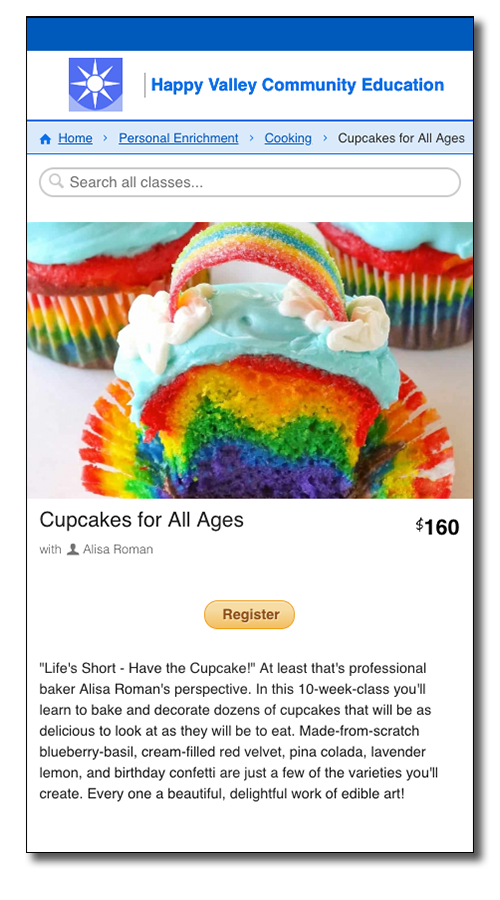
These multi-colored rainbow cupcakes show an attainable challenge with a charming payoff. |
 |
 |
|
It’s clear that what is shown are cupcakes and probably tasty ones. Their colorful frosting looks achievable by people of all experience levels. However, they don’t look especially inspiring or challenging, and therefore people may feel they already know what this class has to offer and won’t bother taking it. The photo is dark and a little blurry. It’s better than no photo, but it’s not necessarily going to motivate someone to hit the button. |
These cupcakes are vibrant and exciting looking. The decoration isn’t complicated, but it’s dramatic and fun. The design is clever but not intimidating. Even a person who’s coming in without any special skills will feel like they could create something like this! Additionally, the photo is crisp and in focus. This image is far more appealing than the first. It’s inspiring and makes that “register” button extra appealing. |
Example 2: Advanced Baking – So Many Cupcakes, So Little Time!
|
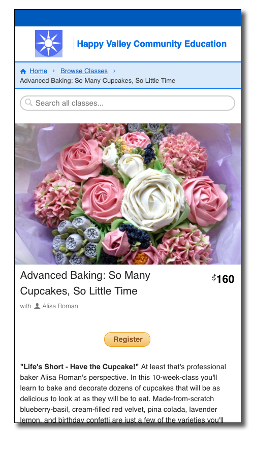
While beautiful, these cupcakes place too much focus on decorating and not enough on baking. They don’t match the class description and may misrepresent the class. |
This decorating scene creates a feeling of involvement and its “in-progress” look will encourage the visitor to complete the scene by hitting the “register” button. |
|
|
|
|
For a class in advanced baking, one might also look at these gorgeous flower cupcakes. However, this image is really all about the decorating, and a very specific style of decorating at that. It also might not represent a style that the instructor is comfortable with, so using this photo could present a risk that someone may have incorrect assumptions about the class based on the image. Due to its specific design, and lack of action, it’s not an ideal photo choice. |
This image makes it clear that the advanced class is making cupcakes from start to finish. The top-down point of view makes it feel like you’re in the middle of making something beautiful. This whole scene offers a delicate balance between being beautiful and being realistic. It feels active, making the viewer want to get right in and make some cupcakes! The photo is general enough to match whatever the teacher covers. Additionally, images that are “incomplete” (like this one) instill a sense of urgency in the viewer, which in this case may lead to a faster registration. |
As you can see, there are many impressions that can be made based on photography selections. When you’re thinking about images, you want to think about what kinds of people might sign up for this class based on the picture selected. What do you think would make your students hit the “register” button and sign up for the course?
Finding Inspiring Images
Finding the perfect photo for every class might seem daunting but there are a myriad of options! You can use a royalty-free image service –a quick internet search will reveal more than you can count, such as Pixabay and Flickr. If you use CourseStorm, you can search for royalty-free images directly from the class editor, or upload your own. You could hire a photographer to visit some of your classes and buy photos from them. Or you could see if one of your classes (maybe, say, a photography class) might be willing to do an assignment about your classes and take pictures that they think would be great for your purposes!
No matter where you get them, you do want to make sure that your images are high resolution, high quality, and inspiring. Your program deserves to look amazing!
The Final Frame
It’s important to think like an advertiser, a student, and a storyteller when choosing photos for your course catalog. Those images will likely be the first thing someone associates with your classes and will be the first impression someone has of that class (and maybe your program.)
As elegantly stated in 1911 by newspaper editor Arthur Brisbane, “Use a picture. It’s worth a thousand words.”
(And as Alisa Roman says, “Life’s Short, Eat the Cupcake!”)
Is preparing your class for social media marketing too time-consuming? You can try CourseStorm for free!

Nic Lyons
Nic is skilled in scaling start-up edtech and education organizations to growth-stage success through innovative marketing. A former journalist and copywriter, Nic holds a postgraduate certificate in digital and print publishing from Columbia University School of Journalism's publishing course.

